Scatter plot: Difference between revisions - Wikipedia
 Article Images
Content deleted Content added
Tag: Reverted |
m |
||
| (27 intermediate revisions by 20 users not shown) | |||
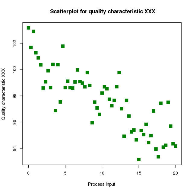
Line 1: {{refimprove|date=April 2024}} {{short description|Plot using the dispersal of scattered dots to show the relationship between variables}} {{distinguish|Correlogram|Scatter matrix}} Line 4 ⟶ 5: | image = Scatter diagram for quality characteristic XXX.svg | category = One of the '''[[Seven Basic Tools of Quality]]''' | describer = [[John Herschel]] | describer = [[John Herschel]]<ref>{{cite journal|last1=Friendly|first1=Michael|last2=Denis|first2=Dan|title=The early origins and development of the scatterplot|journal=Journal of the History of the Behavioral Sciences|date=2005|volume=41|issue=2|pages=103–130|doi=10.1002/jhbs.20078|pmid=15812820}}</ref>▼ | purpose = To identify the type of relationship (if any) between two quantitative variables}} [[Image:oldfaithful3.png|thumb|240px|Waiting time between eruptions and the duration of the eruption for the [[Old Faithful Geyser]] in [[Yellowstone National Park]], [[Wyoming]], USA. This chart suggests there are generally two types of eruptions: short-wait-short-duration, and long-wait-long-duration.]] [[Image:Scatter plot.jpg|thumb|240px|A 3D A '''scatter plot''', also called a '''scatterplot''', '''scatter graph''', '''scatter chart''', '''scattergram''', or '''scatter diagram''',<ref>{{cite book |last=Jarrell |first=Stephen B. |title=Basic Statistics |year=1994 |publisher=Wm. C. Brown Pub. |location=Dubuque, Iowa |isbn=978-0-697-21595-6 |edition=Special pre-publication |page=492 |quote=When we search for a relationship between two quantitative variables, a standard graph of the available data pairs (X,Y), called a ''scatter diagram'', frequently helps...}}</ref> is a type of [[Plot (graphics)|plot]] or [[mathematical diagram]] using [[Cartesian coordinate system|Cartesian coordinates]] to display values for typically two [[Variable (mathematics)|variables]] for a set of data. If the points are coded (color/shape/size), one additional variable can be displayed. The data are displayed as a collection of points, each having the value of one variable determining the position on the horizontal axis and the value of the other variable determining the position on the [[vertical axis]].<ref>Utts, Jessica M. ''Seeing Through Statistics'' 3rd Edition, Thomson Brooks/Cole, 2005, pp 166-167. {{isbn|0-534-39402-7}}</ref> ▲ == Overview == A scatter A scatter plot can suggest various kinds of correlations between variables with a certain [[confidence interval]]. For example, weight and height would be on the {{mvar|y}}-axis, and height would be on the {{mvar|x}}-axis. Correlations may be positive (rising), negative (falling), or null (uncorrelated). If the dots' pattern slopes from lower left to upper right, it indicates a positive [[correlation]] between the variables being studied. If the pattern of dots slopes from upper left to lower right, it indicates a negative correlation. A line of [[Curve fitting|best fit]] (alternatively called 'trendline') can be drawn to study the relationship between the variables. An equation for the correlation between the variables can be determined by established best-fit procedures. For a linear correlation, the best-fit procedure is known as [[linear regression]] and is guaranteed to generate a correct solution in a finite time. No universal best-fit procedure is guaranteed to generate a correct solution for arbitrary relationships. A scatter plot is also very useful when we wish to see how two comparable data sets agree to show nonlinear relationships between variables. The ability to do this can be enhanced by adding a smooth line such as [[Local regression|LOESS]].<ref>{{cite book | last = Cleveland | first = William | title = Visualizing data | publisher = At & T Bell Laboratories Published by Hobart Press | location = Murray Hill, N.J. Summit, N.J | year = 1993 | isbn = 978-0963488404 | url-access = registration | url = https://archive.org/details/visualizingdata00will }}</ref> Furthermore, if the data are represented by a mixture model of simple relationships, these relationships will be visually evident as superimposed patterns.{{fact|date=April 2024}} The scatter diagram is one of the [[Seven Basic Tools of Quality|seven basic tools]] of [[quality control]].<ref>{{cite web | url = http://www.asq.org/learn-about-quality/seven-basic-quality-tools/overview/overview.html | author = Nancy R. Tague | title = Seven Basic Quality Tools | year = 2004 | work = The Quality Toolbox | publisher = [[American Society for Quality]] | location = [[Milwaukee, Wisconsin]] | page = 15 | access-date = 2010-02-05}}</ref> Scatter charts can be built in the form of [[bubble chart|bubble]], marker, or/and [[line chart]]s.<ref>{{cite web|title=Scatter Chart == Example == For example, to display a link between a person's lung capacity, and how long that person could hold their breath, a researcher would choose a group of people to study, then measure each one's lung capacity (first variable) and how long that person could hold their breath (second variable). The researcher would then plot the data in a scatter plot, assigning "lung capacity" to the horizontal axis, and "time holding breath" to the vertical axis.{{fact|date=April 2024}} A person with a lung capacity of {{val|400|ul=cl}} who held their breath for {{val|21.7|u=seconds}} would be represented by a single dot on the scatter plot at the point (400, 21.7) in the [[Cartesian coordinate system|Cartesian coordinates]]. The scatter plot of all the people in the study would enable the researcher to obtain a visual comparison of the two variables in the data set and will help to determine what kind of relationship there might be between the two variables.{{fact|date=April 2024}} == Scatter plot matrices == For a set of data variables (dimensions) ''X''<sub>1</sub>, ''X''<sub>2</sub>, ... , ''X''<sub>''k''</sub>, the scatter plot matrix shows all the pairwise scatter plots of the variables on a single view with multiple scatterplots in a matrix format. For {{mvar|k}} variables, the scatterplot matrix will contain {{mvar|k}} rows and {{mvar|k}} columns. A plot located on the intersection of row and {{mvar|j}}th column is a plot of variables ''X''<sub>''i''</sub> versus ''X''<sub>''j''</sub>.<ref>[http://www.itl.nist.gov/div898/handbook/eda/section3/scatplma.htm Scatter Plot Matrix] at itl.nist.gov.</ref> This means that each row and column is one dimension, and each cell plots a scatter plot of two dimensions.{{fact|date=April 2024}} A '''generalized scatter plot matrix'''<ref>{{cite journal|last1=Emerson|first1=John W.|last2=Green|first2=Walton A.|last3=Schoerke|first3=Barret|last4=Crowley|first4=Jason|title=The Generalized Pairs Plot|journal=Journal of Computational and Graphical Statistics|date=2013|volume=22|issue=1|pages=79–91|doi=10.1080/10618600.2012.694762|s2cid=28344569}}</ref> offers a range of displays of paired combinations of categorical and quantitative variables. A [[mosaic plot]], [[fluctuation diagram]], or faceted [[bar chart]] may be used to display two categorical variables. Other plots are used for one categorical and one quantitative variables. Line 31 ⟶ 37: == See also == *[[Data and information visualization]] *[[Rug plot]] *[[Bar graph]] *[[Line chart]] *[[Scagnostics]] *[[Dot plot (statistics)]] *[[Parity plot]] == References == {{reflist}} == Further reading == * Cattaneo, Matias D.; Crump, Richard K.; Farrell, Max H.; Feng, Yingjie (2024). "[https://www.aeaweb.org/articles?id=10.1257/aer.20221576 On Binscatter]". ''American Economic Review''. '''114''' (5): 1488–1514. == External links == * {{Commonscatinline}} * [http://www.psychwiki.com/wiki/What_is_a_scatterplot%3F What is a scatterplot?] {{Webarchive|url=https://web.archive.org/web/20200807004431/http://www.psychwiki.com/wiki/What_is_a_scatterplot%3F |date=2020-08-07 }} * [http://www.r-statistics.com/2010/04/correlation-scatter-plot-matrix-for-ordered-categorical-data/ Correlation scatter-plot matrix for ordered-categorical data] – Explanation and R code * [http://www.r-bloggers.com/ggplot2-for-big-data/ Density scatterplot for large datasets] (hundreds of millions of points) | |||